The Ultimate Guide: 200+ Tableau Interview Questions and Answers to Secure a Tableau Role

Last updated:
Hello Vizards, I’m Sateesh Kumar, a Tableau Consultant living in Melbourne, Australia. You can connect me on Linkedin. I’ve started my career in 2006 as an SAP Business Objects intern and worked up my way to Tableau Architect. I share my Data visualization/Storytelling and Tableau knowledge at Vizard. I wrote this Tableau Interview Questions guide based on my personal experience.
I’ve been on both sides of the table, as an interviewee and also as an interviewer. I have put together this comprehensive Tableau Interview Questions and Answers guide to help anyone attending Tableau interviews to succeed.
How it all Started:
Few people in my Linkedin network started asking me how to answer some Tableau interview questions and I patiently explained everyone about tableau interview questions. But when I noticed an increase in requests, I thought to myself this is not going to scale, and then I put up a post asking if anyone was interested in the Tableau Interview Questions guide I was putting together.
I didn’t expect such a terrific response to my Linkedin post (530k+ reach, 4000+ likes, and comments).

The result of 130+ hours of time and effort and 28 versions of the document is this comprehensive guide covering 200+ Tableau interview questions consisting of Tableau technical, data visualization, behavioral, thought process, Client communication, HR, and culture fit questions to give you a complete 360-degree interview experience.
Note: This is a massive 22,000-word Tableau Interview Questions guide which might take a few hours to read. For your convenience, I’ve put together the complete guide (this article has only 80 Tableau interview questions, pdf has all 210) in a handy pdf for you to reference when you want. Grab it below.
Preface:
There’s no way to predict what Tableau Interview Questions you’ll be asked. Also, it’s not possible to give a script for every scenario since every individual’s experience, situation, interviewer experience, and project requirement is different.
You find direct answers to tableau interview technical questions below. But for HR/Behavioral/Culture fit/thought process questions (in the pdf) you may find guidelines on how to answer tableau interview questions based on my own experience. Please prepare answers to those tableau interview questions using those guidelines and find your own voice.
Answers of tableau interview questions below represent my own experience and thoughts, but not related to any of my employers or Tableau.com.
While I tried my level best to write accurate answers, inadvertently I would have missed or incorrectly answered a few. Appreciate if you can email me sk@vizard.co so I can correct them.
Introduction:
In one sentence, Interview is all about selling yourself to convince the interviewer you are worth hiring and you can bring value to the company.
I would like to set the stage with this key thing I would want you to keep in mind during the interview (or later at work).
What do clients look for in a Tableau interview or at the job?
We all intend to deliver our best work to the client once we join them, but how can you prove your worth even before you start working for them? how can you differentiate yourself from the rest of the candidates? that’s where you have an opportunity to shine in the interview.
You have to demonstrate and convince the interviewer you are worth hiring by providing value upfront during the interview. Your job at this point is to show your prospect client/employer how hiring you will result in them making more money or save money (or whatever the net result of your work is).
You need to STAND OUT in the interview. You need to blow their minds by answerig tableau interview questions.
From my experience, counter-intuitively companies will not hire you for your ability to build dashboards/ your data visualization skills alone (although that’s important as part of your job), they hire you “expecting you to solve business problems for them”. That’s their underlying intention.
Regardless of your level of experience or skills, your client/interviewer wants to know “what value can you bring to the table”. I have over a decade experience, I know X Y Z tools, I’m a great learner, I love cats etc are great to know, but what is the “value you can bring to the table”?
It’s not about you and your skills, it’s about them (company, client, their products/services, their business).
I’m stressing this because this is often overlooked and so important to get the best outcomes in the interview/ project and great client relationship.
You have to zoom out a little bit and start looking at the forest for the trees. The bigger picture, why do/did client have to hire you? What’s the WHY behind their project?
They have some business problems to solve, they have to go from point A to point B. Help them get there and you will be a rock star. Speak their language. Speak what they want to listen.
It could be helping them understand where the revenue is leaking, or which department has most expenses and why, how are we projected for our sales next season or what can we do to improve our customer experience based on what we learned from data etc. you get the idea.
The better you understand the business/client’s pain points, the better you can solve them and make them happy and can answer tableau interview questions. That’s the holy grail of great client relationship and more opportunities in the future. That’s how you will stand out from your peers and become a valuable resource client’s rave for.
Sounds good, but how can I show value upfront without knowing to join them/ knowing anything about their business?
There is an opportunity if you think out of the box. Do a thorough analysis on the company, their products or services, their challenges, google about the company and you may find some news or some media mention about them or you may know a friend who works/worked for that company or a quick search on Linkedin shows employees working at that company, connect to them with a custom request explaining your situation and request them for some information.
You should be able to find something that leads to some valuable discovery worth noting and talking about during the interview. When you are given a chance to ask questions at the end of the interview, talk about what you discovered, ask questions about their products/services, what business problems are they facing, what’s the WHY, the pain behind the project etc. and offer a mini solution for the problem they may have. It’s a quick win.
This shows your upfront work, your preparedness, curiosity, and keenness in the role.
You get brownie points here. This approach of offering upfront value and proving your worth to get hired makes you stand out among other candidates.
Remember our dashboard or report skills are means to an end, you will have to sell them on your ability to solve business problems.
Data Visualization:
1. What is data visualization?
Data Visualization is a form of visual communication. At its core, it’s about encoding aggregations and representing data visually, in order to gain insight from the data. Data visualization allows for immediate insight by tapping into our mind’s powerful visual processing system.
A primary goal of data visualization is to communicate information clearly and efficiently via graphs and charts. Effective visualization helps users analyze and reason about data and evidence. It makes complex data more accessible, understandable and usable.
Think of all the popular data visualization works out there—they all tell an interesting story. Maybe the story was to convince you of something. Maybe it was to compel you to action, enlighten you with new information, or force you to question your own preconceived notions of reality. Whatever it is, the best visualization, big or small, helps you see what the data has to say.
2. How do you explain data visualization to a layman?
Data visualization is the process of displaying data in graphical charts so that businesses can find insights quickly and easily to make better decisions for good outcomes.
3. Why did you choose data visualization?
Data Visualization helps us solve business problems faster or better. They bring some new insights which often have a monetary value associated with it. Visualization often enables problems with the data to become immediately apparent.
A visualization commonly reveals things not only about the data itself but also about the way it is collected. With an appropriate visualization, errors and artifacts in the data often jump out at you. For this reason, visualizations can be invaluable in quality control too.
By practicing data visualization, it gives me an opportunity to make a direct impact on the businesses bottom line.
4. Why Do We Visualize Data?
Humans respond to and process visual data better than any other type of data. In fact, the human brain processes image 60,000 times faster than text, and 90 percent of information transmitted to the brain is visual.

We visualize data to harness the incredible power of our visual system to spot relationships and trends. Seeing the numbers visually gives us a quick understanding of how business is performing so we can make data-backed decisions.
5. How do you define a dashboard?
A dashboard is a visual display of information that helps us visually display, track and analyze key performance indicators (KPI) and metrics to monitor the health of a business.
A dashboard is also defined as a visual display of the most important information needed to achieve one or more objectives that have been consolidated on a single screen so it can be easily monitored and understood at a glance.
The dashboard gives the ability is to spot the exception, highs, and lows and then drilling into the specifics all in one place.
6. Briefly explain the process you follow in a data visualization project from start to finish?
- First begin with understanding client business, technical and business requirements.
- Understand the context of the visualization and audience who we intend to build.
- Capture user stories/business problems they are trying to address.
- Understand the data model, data analysis, and data preparation.
- Storyboard/sketch initial prototype to solve the above problems.
- Choose an appropriate visual that effectively brings the story live and answers the business questions.
- Remove unnecessary elements, keep it clean and simple.
- Showcase the visualization to stakeholders, seek feedback and iterate.
- Data reconcile to make sure the numbers in the visualization are matching to the numbers in the source.
- Unit testing, System testing, UAT, approval and deploying to production.
- User training, support, and maintenance.
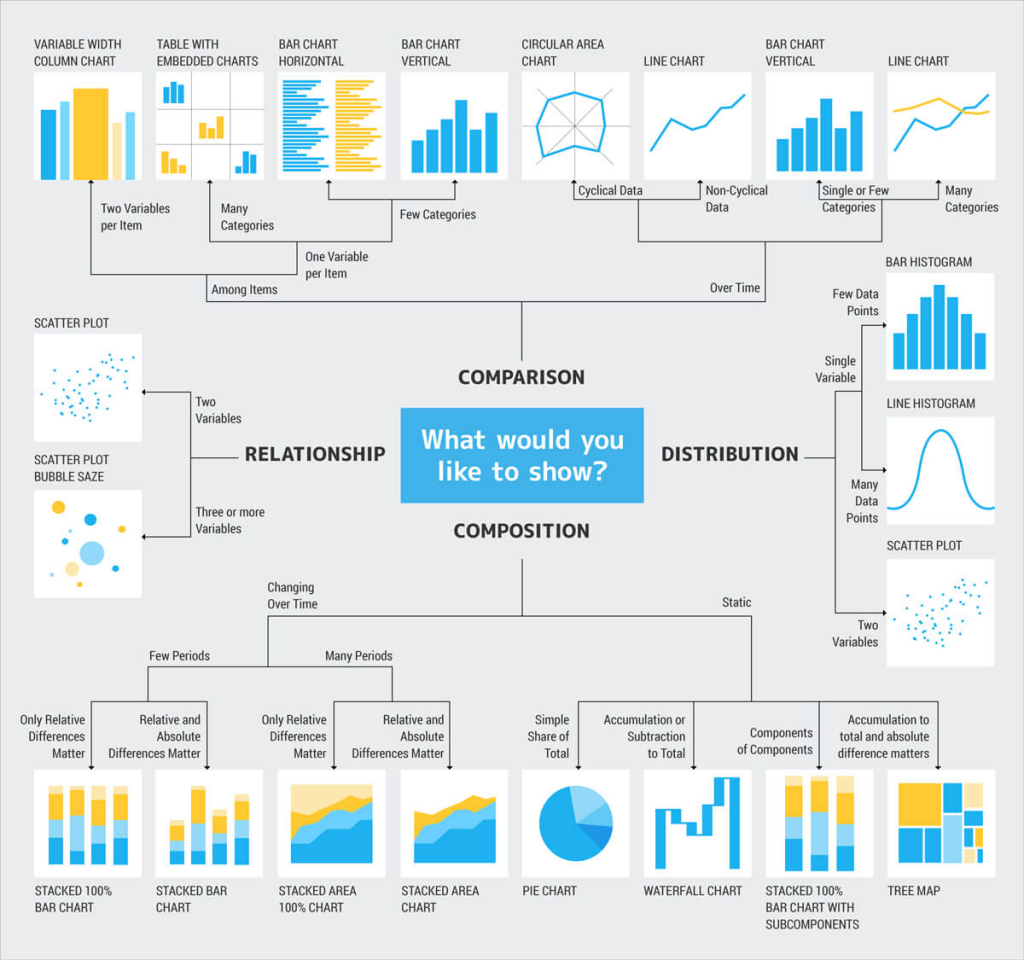
7. How do you choose a visual to represent data?
First, we have to think about what it is that we want our audience to be able to do with the data (function) and then create a visualization (form) that will most efficiently and most accurately convey the data’s meaning.
When you display the data visually using the right chart, you’ll be able to easily uncover meaningful patterns and correlations from a set of otherwise indecipherable numbers.
Below are the four data relationships that are used when visualizing the data:
A comparison tries to set one set of variables apart from another and display how those two variables interact, like the number of visitors to five competing websites in a single month.
A composition tries to collect different types of information that make up a whole and display them together, like the search terms that those visitors used to land on your site, or how many of them came from links, search engines, or direct traffic.
A distribution tries to lay out a collection of related or unrelated information simply to see how it correlates, if at all, and to understand if there’s any interaction between the variables, like the number of bugs reported during each month of a beta.
A relationship tries to show a connection or correlation between two or more variables through the data presented, like the market cap of a given stock over time versus the overall market trend.
Here is a handy diagram created by Dr.Andrew Abela that can be used to determine the right chart type to use in your data visualization.
8. What is a Column chart?
A column chart visualizes data as a set of rectangular columns, their lengths being proportional to the values they represent. The vertical axis shows the values, and the horizontal axis shows the categories they belong to. In multi-series column charts, values are grouped by categories.
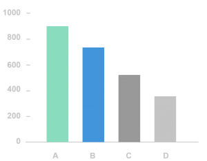
9. What is a Bar chart?

A bar chart visualizes data as a set of rectangular bars, their lengths being proportional to the values they represent. The horizontal axis shows the values, and the vertical axis shows the categories they belong to.
So, the bar chart is a vertical version of the column chart. In multi-series bar charts, values are grouped by categories. They are also preferred when the category names are long or also to show ranking.
10. What is a Line chart?

A Line Chart is the most popular type of data visualization. As a rule, it is used to emphasize trends in data over equal time intervals, such as months, quarters, fiscal years, and so on.
It displays information as a series of data points called ‘markers’ connected by straight line segments. The X-axis holds the categories while the Y-axis holds the values.
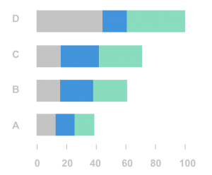
11. What is a Stacked Bar chart?
The Stacked Bar Chart is composed of multiple Bar series stacked horizontally one after another. The length of each series depends on the value in each data point. Stacked Bar Charts make it easier to follow the variation of all the variables presented, side by side, and watch the change in their total.
12. What is a Stacked Column Chart?
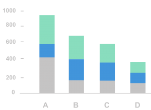
The Stacked Column Chart comprises several Column series stacked vertically, one on another. Each series’ length is determined by the value in each data point. Stacked Column Charts are a great option if you need to observe the change in each of several variables simultaneously and in their sum.
You should pick this type of chart only in case the number of series is higher than two. With just one series, it would be the Column Chart.
13. What is a Scatter Plot?
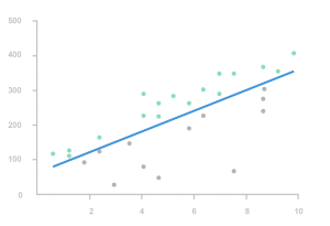
A scatter plot chart will show the relationship between two different values. This is particularly useful to identify outliers or to understand the correlation in the data.
The datasets need to be in pairs with a dependent variable and an independent variable. The dependent (the one the other relies on) becomes the y-axis and the independent, the x.
When the data is distributed on the plot, the results show the correlation to be positive, negative or nonexistent. Adding a trend line will help show the correlation and how statistically significant the correlation is. Example: With trend lines, you can answer such questions as to whether profit is predicted by sales, or whether average delays at an airport are significantly correlated with the month of the year.
Read more here
14. What is an Area Chart?

An area chart is a chart type based on the line chart: it also shows information as a series of data points connected by straight line segments, but the area between the X-axis and the line segments is filled with color or a pattern.
The area chart emphasizes the magnitude of change over time and can be used to highlight the total value across a trend. For example, an area chart displaying profit over time can emphasize the total profit.
15. What is a Choropleth Map?

Choropleth Map displays divided geographical areas or regions that are colored, shaded or patterned in relation to a data variable. This provides a way to visualize values over a geographical area, which can show variation or patterns across the displayed location.
16. What is a TreeMap?

A treemap is a visualization that displays hierarchically organized data as a set of nested rectangles, parent elements being tiled with their child elements. The sizes and colors of rectangles are proportional to the values of the data points they represent.
17. What is a Slope Graph?

A slope graph is a lot like a line graph, in that it plots change between points. However, a slope graph plots the change between only two points, without any kind of regard for the points in between.
It is based on the idea that humans are fairly good at interpreting changes in direction. Decreases and quickly rising increases are easily detected.
18. What is a Waterfall chart?
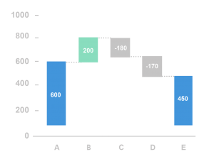
The Waterfall Chart type is generally used to understand the influence of several positive and negative factors on the initial value. Points are utilized to display the process of the initial value change and can be in one of the three states: increase, decrease, or total (subtotal).
The first and last columns in a Waterfall Chart usually represent totals. The intermediate ones stand for the changes
19. What is a Heat Map?

A heat map is a visual representation of data that uses color-coding to represent different values in a matrix.
Essentially, this type of chart is a data table with rows and lines denoted by different sets of categories. Each table cell can contain a numerical or logical value that determines the cell color based on a given color palette.
Heat maps are convenient data visualization for comparing categories, using color to emphasize relationships between data values that would be much harder to understand in a simple table with numbers.
20. What is a Bullet graph?
A bullet graph is a variation of a bar graph developed to replace dashboard gauges and meters. A bullet graph is useful for comparing the performance of a primary measure to one or more other measures. It shows a distribution showing progress towards a goal behind the bar.
21. What is a Gantt Chart?

The Gantt Chart is a type of bar diagram used to illustrate plans and activity schedules of any project. It is a project management tool. Gantt Chart consist of bars stretched along the time axis.
In this type of diagram, each bar represents a certain task within the framework of the project in question. The ends of the bar stand for the task’s start and finish time, and the length reflects duration. The Gantt Chart’s vertical axis is a task list.
22. What is a Histogram chart?
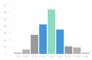
A Histogram visualizes the distribution of data over a continuous interval or a certain time period. Each bar in a histogram represents the tabulated frequency at each interval/bin. The total area of the Histogram is equal to the number of data.
Histograms help give an estimate as to where values are concentrated, what the extremes are and whether there are any gaps or unusual values. They are also useful for giving a rough view of the probability distribution.
23. What are some of the charts you avoid and why?
3d charts– They skew the visual perception of the numbers making them difficult or impossible to interpret or compare. It also introduces unnecessary chart elements like side and floor panels which is not only a cognitive load on the brain but also inaccurate.
Pie charts – This is not being as accurate as bar charts or position-based visuals. With pie, we are judging areas and angles which is much more difficult than the length in a bar chart. Our eyes cannot ascribe quantitative values to areas and angles properly.
Donut charts– This is similar to the pie chart, but with a hole cut out in the middle so that it looks like a donut. Because there’s a hole in the middle, we don’t judge values by angle anymore. Instead, we have to compare one arc length with to another arc length. Our eyes cannot ascribe quantitative values to arc length properly.
24. Can you explain some Data Visualization design best practices?
From Storytelling with data book.
- Form follows function: First, we want to think about what it is we want our audience to be able to do with the data (function) and then create a visualization (form) that will allow for this with ease.
- Don’t assume that two different people looking at the same data visualization will draw the same conclusion.
- Leverage pre-attentive attributes to make those important words stand out.
- Offer your audience visual affordances as cues for how to interact with your visualization.
- Highlight the important stuff and eliminate distractions.
- Make it legible and clean.
- Label and title as appropriate, so there’s no work going back and forth between a legend and the data to decipher what is being graphed.
- Whatever data is required for context, but doesn’t need to be highlighted, push it to the background.
- Employ attributes like color, thickness, size, position, labeling, text and annotation to emphasize and de-emphasize components throughout the visual.
- If there is a conclusion you want your audience to reach, state it in words.
From The Functional Art book
- Adding tons of special effects to a graphic will not make it any better if it lacks good information. The special effects take away space that could have been used to highlight other angles of the story.
- Don’t create fancy visualizations with tons of bubbles, lines, bars, and filters and expect readers to figure the story out by themselves and draw conclusions from the data. That’s not an approach to information graphics. Not all readers are data analysts.
- Don’t just show stuff; explain the main points, focusing the reader’s attention on the most interesting parts of the information.
From Good Charts book
- Include four elements in all charts: title, subtitle, visual field, and source line. Within the visual field include axes, labels, and sometimes captions and legends.
- Make all the elements support the visual. Use them to highlight the idea, not to describe the chart’s structure.
- Remove ambiguity. Make sure each element has a single purpose that can’t be misinterpreted.
- Minimize the number of colors you use. Gray works for contextual and second-level information and for structural elements such as grid lines.
- Limit eye travel. Place labels and legends in close proximity to what they describe.
Tableau Desktop
25. Why did you choose to work on Tableau or What makes it different from other tools?
There are many reasons why Tableau is the best data visualization tool. Here are a few.
- Tableau helps us see and understand the data easily which enable us to make data-driven decisions.
- It has the best implementation speed with simple drag and drop and enhanced analytic workflow experience for users.
- Powerful, intuitive yet Simple
- Fast turnaround time and variety of features.
- Makes discovering deep insights for management easy, which in turn drives Organizations.
- It brings the creative and logical side together to tell the story of the data.
- Clear visuals, user-friendly and easy to understand.
- It enables pure self-service and reduces dependency on a central IT Team.
- It helps data paint meaningful pictures.
- Connecting to multiple data sources is such an ease.
- Creates stunning visualizations in seconds and helps to connect dots and create a fulfilling story.
- A great community around to support and learn from.
26. What are interactive dashboards?
Dashboards which enable us to interact with various elements like filters, parameters, actions, and slice and dice the data to get better insights or answer complex questions.
27. What is Show Me feature in Tableau?
Show Me is a useful feature in Tableau which creates a visual based on the fields already used in the view and any fields you’ve selected in the Data pane.
28. What is a Tableau data pane?
A pane on the left side of the workbook that displays the fields of the data sources to which Tableau is connected.
29. What are different ways of connecting data?
You can connect Live or as an Extract. It depends on the project requirements.
In general, if the business needs up to the minute/ live data updates to the dashboard, we use Live connections. But it comes with performance impact due to constant expensive data refresh operations.
In all other cases, extracts are preferred. Extract files are a local copy of a subset or entire data source that you can use to share data, work offline, and improve database performance. They can be scheduled to run at off-peak hours avoiding slow load times.
30. How do you prepare data for reporting?
The first step towards exploring your data with Tableau is by looking at how the data is structured. The more granular the data is the easier it is for us to work with, visualize and answer business questions. If the data is already aggregated, we will be limited by the capability of visualization.
31. What is marks card in Tableau?
A card to the left of the view where you can drag fields to control mark properties such as type, color, size, shape, label, tooltip, and detail.
32. What are shelves in Tableau?
They are named areas to the left and top of the view. You build views by placing fields onto the shelves. Some shelves are available only when you select certain mark types. For example, the Shape shelf is available only when you select the Shape mark type.
33. What is a Published data source?
It contains connection information that is independent of any workbook and can be used by multiple workbooks.
34. What is a data source page?
A data source page is where you can set up your data source. The Data Source page generally consists of four main areas: left pane, join area, preview area, and metadata area.
35. What is a formatting pane in Tableau?
A format pane contains formatting settings that control the entire worksheet, as well as individual fields in the view.
36. When do you use horizontal and vertical containers?
Horizontal and vertical containers are used to organize different visual components in a dashboard. It’s easy to format and keep visuals consistent within containers. These containers create an area in the dashboard where objects automatically adjust their size and position based on the other objects in the container.
37. What is Page shelf?
Tableau provides a distinct and powerful tool to control the output display known as Page shelf. As the name suggests, the page shelf fragments the view into a series of pages, presenting a different view on each page, making it more user-friendly and minimizing scrolling to analyze and view data and information. You can flip through the pages using the specified controls and compare them at a common axle.
38. How many ways to use parameters in Tableau
We can use parameters with filters, calculated fields, actions, measure-swap, changing views and auto updates.
39. What is a Hierarchy?
When you connect to a data source, Tableau automatically separates date fields into hierarchies so you can easily break down the viz. You can also create your own custom hierarchies. For example, if you have a set of fields named Region, State, and County, you can create a hierarchy from these fields so that you can quickly drill down to levels in the viz.
40. What are Automatic Hierarchies?
When you connect to a data source, Tableau automatically separates date fields into hierarchies so you can easily break down the view by year, quarter, month, etc. We can observe a plus symbol adjacent to the field those are part of the hierarchy.
41. What is an Analytics Pane?
The Analytics pane provides quick and easy access to common analytic objects in Tableau. You can drag reference lines, forecasts, trend lines, and other objects into your view from the Analytics pane, which appears on the left side of the workspace.
42. What are groups?
Group simplifies large numbers of dimension members by combining them into higher-level categories. You can create a group to combine related members in a field. For example, if you are working with a view that shows average test scores by major, you might want to group certain majors together to create major categories. English and History might be combined into a group called Liberal Arts Majors, while Biology and Physics might be grouped as Science Majors.
43. What are sets?
Sets are custom fields that define a subset of data based on some conditions. A set can be based on a computed condition, for example, a set may contain customers with sales over a certain threshold. Computed sets update as your data changes. Alternatively, a set can be based on a specific data point in your view.
44. What are the differences between groups and sets?
Groups simplify large numbers of dimension members by combining them into higher-level categories.
Sets create a custom field based on existing dimensions that can be used to encode the view with multiple dimension members across varying dimension levels.
45. What is a bin?
Sometimes it’s useful to convert a continuous measure (or a numeric dimension) into bins.
Any discrete field in Tableau can be considered as a set of bins. For example, suppose you create a view with Profit on Rows and State on Columns.
You could consider the State field as a set of bins -each profit value is sorted into a bin corresponding to the state from which the value was recorded. But if you want to see values for Profit assigned to bins without reference to a dimension, you can create a numeric bin, with each individual bin corresponding to a range of values.
46. How do you handle Null Values?
Null values along an axis are indicated in the lower right corner of the view. Click the indicator to open a dialog box that will help you decide how to handle these values. The options available in the dialog box depend on the type of data in the view.
47. What are Rank and Percentile?
Use rank when you are interested in seeing the order of values in a list. For example, you could apply a rank table calculation to a table to see which product category ranked highest in sales over a four-year period.
Percentile is available as aggregation and as a table calculation. To use one of the built-in percentile aggregations, right-click a measure in the view and select Measure > Percentile and then choose one of the numeric options.
48. What is Secondary Axes?
In addition to blending multiple measures on the same axis, you can add a secondary axis or dual axis to a view to better compare measures of different scales.
49. What are Aggregated Extracts?
You can optimize your extracts by only including the data you need. Specifically, you can exclude columns, create filters to limit the number of rows, aggregate data, and roll updates.
50. What are Incremental Extract Updates?
When you import all or some of your data into Tableau’s data engine, you create a data extract. After you create the initial extract, you can set up an incremental refresh so that importing new data doesn’t require you to rebuild the entire extract. An incremental refresh can be defined by the values in a specified column. For example, if you’ve created an extract that has date values, you can define the incremental refresh to only add new rows if there are additions in the date column.
51. How to use Data Interpreter to Prepare the Data Source for Analysis?
Sometimes, the format of your data makes it difficult to analyze in Tableau. For example, your data might include sub-tables, hierarchical headers, extraneous headers, and footers, or blank rows and columns.
The Data Interpreter draws out sub-tables and removes some of that extraneous information to help prepare the data source for analysis. Note: You are prompted to use the Data Interpreter only if Tableau detects sub-tables or extraneous information and if your connector supports it.
52. What are the different products Tableau offers?
Tableau offers 5 products.
Tableau Desktop: Tableau desktop is considered as “the gold standard” in visual analytics. It is a self-service data visualization tool that lets you analyze virtually any type of structured data and produce highly interactive, and stunning dashboards, and reports in just minutes.
With tableau desktop, you can directly connect to data from multiple data sources: data warehouse, flat files, cloud application or web sources. Tableau desktop brings all your data together into one single view. It helps to identify patterns, opportunities, and ask questions to drive business profitability. Tableau makes analyzing data and making better decisions faster.
Tableau Server: Tableau Server lets you centrally manage, collaborate and securely host the dashboards published from Tableau desktop. It empowers the business with the freedom to explore data in a trusted environment—without limiting them to pre-defined questions, or chart types.
Users can edit and update the workbooks and dashboards online or Server but cannot create new ones. However, there are limited editing options when compared to desktop.
Tableau server connects to any data source securely – whether on-premise or in the cloud. Publish and share your data sources as live connections or extracts for everyone to use.
The Tableau platform is easy to deploy, scale, and monitor. Easily track and manage content, users, licenses, and performance. Quickly manage permissions for data sources and content and monitor usage visually.
Tableau Online: Tableau Online is an analytics platform fully hosted in the cloud. It enables you to publish dashboards and share your discoveries with anyone. Invite colleagues or customers to explore hidden opportunities with interactive visualizations and accurate data. All easily accessible from a browser or on the go with Tableau mobile apps.
Tableau Reader: Tableau Reader is a free desktop application that you can use to open and interact with data visualizations built in Tableau Desktop. Filter, drill down and discover. But this needs the packaged workbook file to be shared across the users which not only is a security issue but also loses track of the correct version.
Tableau Public: Tableau Public is a free service that lets anyone publish interactive data visualizations to the web. Visualizations that have been published to Tableau Public can be embedded into web pages and blogs, they can be shared via social media or email, and they can be made available for download to other users.
53. What type of data limitations does Tableau Public have?
Tableau Public can only connect to a few data sources like Microsoft Excel, Microsoft Access, and multiple text file formats. It has a limit of 1,000,000 rows of data that is allowed in any single file.
54. Explain the difference between Tableau Workbook, Story, Dashboard, and Worksheets?
Workbooks and sheets: Tableau uses a workbook and sheet file structure, much like Microsoft Excel.
A Workbook contains your views, dashboards, and stories, and data connection. You can include local resources, such as background images and custom geocoding if they reside in a location that the server or other Tableau users cannot access.
A worksheet contains a single view along with shelves, legends, and the Data pane. A worksheet is where you build views of your data by dragging and dropping fields onto shelves.
A dashboard is a collection of several worksheets and supporting information shown in a single place so you can compare and monitor a variety of data simultaneously. For example, you may have a set of views that you review every day. Rather than flipping through each worksheet, you can create a dashboard that displays all the views at once.
A story is a sheet that contains a sequence of worksheets and dashboards that work together to convey information. Use stories to make your case more compelling by showing how facts are connected, and how decisions relate to outcomes. You can then publish your story to the web, or present it to an audience.
Within a workbook, you can create new sheets, clear an entire worksheet, duplicate sheets, hide or show a worksheet, and delete a sheet. Tableau has several ways to view and organize the sheets in your workbook.
Note:
From Worksheet, we can access Source Data Dimensions, Measures, and Custom Fields.
From the Dashboard, we can access Worksheet but we cannot access dimensions measures directly.
From Story, we can access the Dashboard and Worksheets but we cannot access dimensions measures directly.
55. Difference between Tiled and Floating in Tableau Dashboards
A dashboard is a collection of worksheets and objects on a single sheet so you can compare and monitor a variety of data simultaneously. Dashboard objects can be tiled or floating. Tiled objects are arranged in a grid while floating objects can be layered on top of other objects.
56. What is an embedded data source and when it is used?
When you publish a workbook to Tableau Online or Tableau Server, you can publish the data it connects to in 2 ways.
As an integrated part of the workbook which is embedding data source connection information within the workbook. This is used when we know a data source is not shared with other dashboards.
As separate, standalone data source which is used when we have to share the same data source with multiple dashboards.
57. How to automate reports using Tableau software?
When you publish workbooks that connect to extracts, you can set up a schedule for updates (refreshes) for those extracts, so the views in those workbooks stay current.
The ways you can set up and manage extract refresh schedules depends on where you publish and on the original data type.
When you publish to Tableau Server, the schedule runs and is managed on the server.
When you publish to Tableau Online: If extracts are from cloud data (for example, Google Analytics or Salesforce), schedules run and are managed on Tableau Online.
If extracts are from on-premises or web data connector (WDC) data, you set up and manage refresh schedules using Tableau Bridge.
Read more here
58. When do we use Join vs Blend?
Use JOIN when you have multiple tables/views from the same data source to be used in the dashboard. This happens at the source level.
Use BLEND when you have multiple tables/views from different data sources to be used in the dashboard. This happens locally.
59. What is a Dimension?
Tableau treats any field containing qualitative, categorical information as a dimension. This includes any field with text or dates values.
60. What is a Measure?
A measure is a field that is dependent on the value of one or more dimensions. Tableau treats any field containing numeric (quantitative) information as a measure.
61. What are the differences between the blue pills and the green pills in Tableau? or What is the difference between discrete and continuous in Tableau?
There are two types of data roles in Tableau – discrete and continuous.
Discrete data roles are values that are counted as distinct and separate and can only take individual values within a range. Examples: names of customers. Discrete values are shown as blue pills on the shelves and blue icons in the data window.
Continuous data roles are used to measure continuous data and can take on any value within a finite or infinite interval. Examples: unit price, revenue or order quantity. Continuous variables behave in a similar way in that they can take on any value. Continuous values are shown as green pills.
This is best explained by Tom Brown and Amanda Patist.
62. What are Filter Actions?
Use the Filter Actions filter to show related information between a source sheet and one or more target sheets. This type of action works well when you are building guided analytical paths through a workbook or in dashboards that filter from a master sheet to show more details.
63. What are some of the new features of Tableau 10.5 version?
Here are some of the new features in Tableau 10.5
Hyper: Hyper is Tableau’s new in-memory data engine technology, designed for fast data ingest and analytical query processing on large or complex data sets. With up to 3X* faster extract creation, you always have the latest data. Up to 5X* increase in query performance keeps you in the flow.
Viz in Tooltip: Engage with your data at a deeper level and maximize dashboard real estate with Viz in Tooltip. Hover over a mark to display details-on-demand while staying in context of the original view.
Nested projects: You can now nest projects within projects, and customize permissions at each level, or choose to use a top-down permission structure. Now it’s easier to organize your workbooks, so everyone in your organization can find what they are looking for.
Power trend lines: Better understand power relationships between variables with drag and drop power trend lines, bringing light to your physics, biology, astronomy, economic data, and more.
Improved workbook version compatibility: Now you can revert your workbooks to an older version with improved workbook version compatibility. Other users in your organization can open and edit a workbook even when they aren’t using the latest version of Tableau Desktop (down to Tableau 10.2).
You can know more here.
64. What formats can we download Views or Workbooks from the server?
The download formats available to you depend on permissions granted by Tableau content owners and site administrators.
Image: Downloads an image of the view in a .png format.
Data: Opens a new tab in the browser window and displays the view’s data in summary and detail. You can then download the data as a comma-separated value (.csv) file.
Crosstab: Downloads the view, or the selected sheet in a dashboard, as a .csv file you can open in Microsoft Excel.
PDF: Downloads a PDF of selected sheets. If you’re downloading a dashboard to PDF format, web page objects aren’t included.
Tableau Workbook: Downloads a workbook you can open with Tableau Desktop.
Note: Downloading extremely large amounts of data can affect server performance and might not complete successfully. If you encounter these issues, try exporting the data directly from the underlying data source.
65. What are the different file extensions in Tableau?
Below are some of the file type’s extensions in Tableau.
Workbooks (. twb)
The. twb is the most common file extension used in Tableau, which presents an XML format file and comprises all the information present in each dashboard and sheet like the fields are used in the views, styles, and formatting applied to a sheet and dashboard. But this workbook in itself does not contain any data. Workbooks hold one or more worksheets, plus zero or more dashboards and stories.
Packaged Workbooks (.twbx)
Tableau packaged workbooks have the .twbx file extension. A packaged workbook is a single zip file that contains a workbook along with any supporting local file data sources and background images. This format is the best way to package your work for sharing with others who don’t have access to the data. Save all the sheets, their connection information and any local resources (e.g., local file data sources, background images, custom geocoding, etc.)
The primary advantage to using .twbx files is that analysis can be performed without network/internet connections to your data because your data is already present on your computer in the packaged file.
Data Source (.tds)
Tableau data source files have the .tds file extension. Data source files are shortcuts for quickly connecting to data sources that you use often. Data source files do not contain the actual data but rather the information necessary to connect to the data source as well as modifications you’ve made in the Data pane such as default properties, calculated fields, groups, and so on.
Packaged Data Source (.tdsx)
Tableau packaged data source files have the .tdsx file extension. A packaged data source is a zip file that contains the data source file (.tds) described above as well as any local file data sources such as Extract files (.tde), text files, Excel files, Access files, and local cube files. Use this format to create a single file that you can then share with others who may not have access to the original data stored locally on your computer.
Extract (.hyper or .tde)
Depending on the version the extract was created in, Tableau extract files can have either the .hyper (10.5+) or .tde file extension. Extract files are a local copy of a subset or entire data set that you can use to share data with others when you need to work offline and improve performance.
Bookmarks (.tbm)
Tableau bookmark files have the .tbm file extension. Bookmarks contain a single worksheet and are an easy way to quickly share your work.
Tableau Map Source (.tms)
You can import a Tableau Map Source (.tms) that someone has shared with you into a workbook, and then use it to create custom map views.
Tableau Preferences (.tps)
Whenever you have to create custom palettes to match your company branding (besides the default Tableau color palettes), you can also create and use your own custom color palettes by modifying the Preferences.tps file that comes with Tableau Desktop.
When you save the workbook and restart Tableau Desktop, the color palette names you added to Preferences.tps appear in the Select Color Palette drop-down list which you can use a new palette like you would any other.
Tableau Datasource Customization (.tdc)
When you use a connector for a database that supports SQL, Tableau generates SQL statements that are tuned for that database. Because Tableau has no representation of the SQL dialect used by an ODBC data source, it must infer the supported syntax through a variety of tests.
You can use Tableau customizations to fine tune this connection information in order to significantly improve performance during the execution of Tableau’s complex SQL statements.
For example, customers can define the SQL statements in which a schema identifier can be used or the level at which their data source conforms to the SQL standard, changing how Tableau queries for metadata, whether it can use temporary tables, how many concurrent queries the data source can support etc. These customizations are made using Tableau’s Datasource Connection (TCD) files.
66. What are some of the Tableau limitations you are aware of?
Here are some limitations in Tableau.
- Parameters don’t accept multiple selections.
- Parameters don’t update dynamically when it is connected to a database field.
- Cannot reference Measure Names/Measure Values in calculations.
- We cannot define the width of columns individually.
- Can’t control the display, selection, order, sorting of columns in view data option for a worksheet view.
67. How is a workbook version controlled in Tableau?
Version control of a workbook can be done in 2 ways.
One at the desktop level where you keep copies of changes on a file system or a 3rd party version control system like Microsoft TFS.
Second is at the server level when you publish a workbook or a data source, a version is saved in the revision history for Tableau Server and Tableau Online. You can revert to a previous version at any time.
68. What is the difference between filter and parameter?
A filter acts directly on a dimension or measure and restricts the domain of the field. For example, to only show California or New York in a State dimension or only show Sales between $100 and $200. There are a lot of options for filters. You can include or exclude members of a dimension, use a wildcard for the member name, choose the top N, given another measure, or use a condition (true/false) to choose what is in and what is out.
A parameter, like is a variable. You can then use that variable inside calculations to change the calculation. If you filter by a calculated field, you essentially have a parameter controlling a filter. Parameters have almost the same UI options like filters, but they are single-valued, so you have options for radio buttons, but not checkboxes. There are also sliders and drop downs. Parameters are global, so can affect calculations for all data sources and connections in a workbook.
Read more here
69. What are Table Calculations
Table Calculations are computations that are applied to the values in the entire table and are often dependent on the table structure itself. For example, in a sales environment, you can use table calculations to compute the running total of sales across a specified date range or to compute each product’s contribution to the total sales in a quarter.
Top 10 table calculations here
70. What is a LOD expression?
Level of detail expressions supports aggregation at dimensionalities other than the view level. With the level of detail expressions, you can attach one or more dimensions to an aggregate expression..
Unlike table calculations, totals, or reference lines, the level of detail expressions are computed in the data source. On the plus side, this lets you avoid the overhead of bringing all the data from the database to your computer over the network. With large data sources, this can be a huge performance gain. On the minus side, this can cause Tableau to run more complicated queries (for example, containing many joins), and if the underlying data source is slow, performance can suffer.
71. Explain Types of Filters in Tableau – Quick, Global, Context, At Source, On Dimensions and Measures?
Quick Filter: Quick Filter Creates an interactive selection panel on the right top corner of the data view. We can implement Quick Filter on Dimensions or Measures. The interactive selection panel provides the options based on the source data.
Example: Quick Filer on Order Date with Yearly Consolidation provides the list of YEARS available from SOURCE DATA for user selection.
Global Filter: Global Filter helps to share the same filter using the same source data across multiple (or) all worksheets within a workbook. We can apply a global filter for all the worksheets using the same data (or) It can be applied to only selected worksheets.
Example: Filter with Complex calculation in one worksheet can be applied to some other worksheet which using the same source data to avoid repetitive work.
Context Filter: Context Filter helps to pass the criteria of the filter from one level to another related level.
Example: Top 10 Customers in the country by their purchases; here the context is ‘Top 10’. We can pass this context to know ‘Top 10’ Customers by Purchases in a State within the same country.
Filter at Source: After connecting with the data source, filtering the data before getting into the worksheet is called filtering at the source. This helps in improved performance because the unwanted data eliminated.
Example: Selecting only one year worth of data from a few years of historical data after connecting with the source
Filter on Measure: This filter provides options – a range of values, at least, at most and special. We can select any option that helps to select the right data or eliminate unwanted data. A special option is to deal with Null values.
Example: Filter on Sum of Sales.
Filter on Dimension: This filter provides options – General, Wildcard, Condition and Top/Bottom. We can select any option that helps to select the right data or eliminate unwanted data. We can also create own formula then use it in this filter options – Condition and Top/Bottom for the data selection needs. Condition and Top/Bottom provides a channel from dimension to measure to get the required data.
Example: Filter on Order Date then selecting sales through dimension.
72. How do we do performance testing in Tableau?
Create a Performance Recording to record performance information about the main events you interact with the workbook. Users can view the performance metrics in a workbook created by Tableau. Help> Settings and Performance> Start Performance Recording Help> Setting and Performance > Stop Performance Recording.
Reviewing the Tableau Desktop Logs located at C:\Users\\My Documents\My Tableau Repository. For live connection to the data source, you can check log.txt and tabprotosrv.txt files. For an extract, check tdeserver.txt file.
73. How can we do load testing in Tableau?
You can do performance testing on Tableau with Tableau Server load-testing solution called TabJolt. You can use TabJolt to push a heavy workload onto Tableau Server to give it a jolt and study how the server bends or breaks under load. While TabJolt is not supported by tableau directly, it has to be installed using other open source products.
74. How do you improve dashboard performance?
- Use an extract Extracts are a quick and easy way to make most workbooks run faster.
There is nothing else that comes close to the efficiency gained using an extract. If you don’t absolutely need live data, extracting is the best bet.
- Reduce the scope whether you’re creating a view, dashboard, or story, it’s tempting to pack a lot of information into your visualization because it’s so easy to add more fields and calculations to the view and more sheets to the workbook. But the result can be that the visualization becomes slower and slower to render.
Remember that each worksheet runs one or more queries against the data, so the more sheets, the longer it takes to render the visualization.
- Reduce the number of marks on the view While there is no hard and fast rule on what defines “too many marks,” be aware that more marks mean that more processing power and memory is required to render them.
- You can find the number of marks by looking at the lower left of the Tableau Desktop window in the status bar. Watch out for large crosstabs and for maps with complex custom polygons. Keep in mind that too many data points on a view can also reduce the visual analytics value by causing information overload.
To avoid this problem, compile related views and connect them with action filters so that you can go from an overview to a more granular view as you explore the data.
- Use Booleans and integers output in calculations when you create calculated fields; the data type you use has a significant impact on the calculation speed. Integers and Booleans are generally much faster than strings. If your calculation produces a binary result (for example, yes/no, pass/fail, over/under), be sure to return a Boolean result rather than a string.
- Limit the data being introduced to each worksheet if you are not planning on using a set of rows, you should filter them out of the data set as early as possible. If your table contains all sales, and you only want to look at US sales, use a data source filter to restrict data to the US alone. Less data is quicker execution.
- Use Context filter creating one or more context filters improves performance as users do not have to create extra filters on a large data source, reducing the query-execution time.
You can create by dragging a filed into ‘Filters’ tab and then, Right-Click that field and select ‘’Add to Context”.
You can create by dragging a filed into ‘Filters’ tab and then, Right-Click that field and select ‘’Add to Context”.
- Hide unused fields Even though we bring all fields from the tables; we end up only using few of them. So, it’s better to remove them from the extract by selecting “Hide All Unused Fields” in worksheets. Bringing fewer data should always improve performance.
- Eliminate any non-essential components from the visualization.
This refers to values that would appear on the Pages, Filters, and Level of Detail Shelves. If they are purely there for the user to see if they scroll over a point, then they aren’t not only not adding any value but also impacting the performance.
- Reduce filters usage Take it easy on parameters and quick filters. Despite the name, too many quick filters will actually slow you down. Particularly if you set them to use ‘Only Relevant Values’ and you’ve got lots of discrete lists. For every Quick filter which is added, Tableau has to execute the query in the database to find out which values to display.
Alternatively, you can use Action filters which do not create any additional database query. Avoid quick filters with Dropdown or Multi-select on high-cardinality columns (columns which has more number of unique values; example: e-mail ids) as it takes too much amount of time to return the result. Alternatively, you can use wildcard match option.
Alternatively, you can use Action filters which do not create any additional database query. Avoid quick filters with Dropdown or Multi-select on high-cardinality columns (columns which has more number of unique values; example: e-mail ids) as it takes too much amount of time to return the result. Alternatively, you can use wildcard match option.
- Assuming Referential Integrity In some cases, you can improve query performance by selecting the option to Assume Referential Integrity from the Data menu. When you use this option, Tableau will include the joined table in the query only if it is specifically referenced by fields in the view. Using this setting is appropriate when you know that your data has referential integrity but your database is not enforcing or cannot enforce referential integrity. If you have the option of configuring referential integrity in your database that is a better option than using this setting because it can improve performance both in the database and in Tableau. The Assume Referential Integrity option in Tableau can only affect performance on Tableau’s end. If your data does not have referential integrity and you turn on this setting, query results may not be reliable.
- Avoid using custom SQL When you connect to multiple tables in your database, Tableau writes a query that has been optimized for that data source. Unless you are very experienced with join operation optimization, writing custom SQL may cause Tableau’s connection to slow down.
- Remove unnecessary calculations, parameters, and sheets.
- Use indexes in the database and use those fields for filtering
- Push heavy lifting (calculations) to database
- Keep report simple and answering specific questions, it not only puts a cognitive load on the reader but also loads on tableau engine.
More resources here
75. How does version compatibility work in Tableau?
From Tableau 10.5, now you can revert your workbooks to an older version with improved workbook version compatibility. Other users in your organization can open and edit a workbook even when they aren’t using the latest version of Tableau Desktop (down to Tableau 10.2).
76. How does Compatibility between Tableau Desktop and Tableau Server work?
A workbook created with any version of Tableau Desktop can connect to any supported version of Tableau Server. But once you are connected, compatibility can be an issue depending on the version you are using and the action you’re performing.
77. How can you restrict access at the row level?
When you share workbooks with others by publishing them to Tableau Server or Online, by default, all users who have access to the workbooks can see all of the data shown in the views. You can override this behavior by applying a type of filter that allows you to specify which data “rows” any given person signed in to the server can see in the view.
Read more here
78. What is Aggregation & Disaggregation?
The process of viewing numeric values or measures at higher and more summarized levels of the data is called aggregation. When you place a measure on a shelf, Tableau automatically aggregates the data, usually by summing it. You can easily determine the aggregation applied to a field because the function always appears in front of the field’s name when it is placed on a shelf.
According to Tableau, disaggregating your data allows you to view every row of the data source which can be useful when you are analyzing measures that you may want to use both independently and dependently in the view. For example, you may be analyzing the results from a product satisfaction survey with the Age of participants along one axis. You can aggregate the Age field to determine the average age of participants or disaggregate the data to determine what age participants were most satisfied with the product.
79. What is Assume referential integrity?
Referential integrity is a concept which ensures that relationships between databases/tables remain consistent, i.e. it ensures that the references to data are valid. You can improve query performance by selecting this option from the data menu. When you use this option, Tableau will include the joined table in the query only if it is specifically referenced by fields in the view.
80. Where can you use global filters?
Global filters can be used in sheets, dashboards and in stories.
Aviral Jain
very helpful for fresher to this tool
Shivanand
thank you so much
srikanth
thanks for providing this iNformation which will help to the people who needs to face tableau interview for the first time
pul
thank you very much 🙂
Shilpi Mishra
It is quite detailed, thanks
arun
very nice
Sreekiran CHALLAPILLA
One of the Simple yet powerful Preparation guide on Tableau – KUDOS TO SATEESH, for his Voluntary Service to help and guide New Data Enthusiasts. Keep Going!
Anonymous
Thankyou …very useful guide
Anonymous
thank you
suresh
MInd Blowing Thank you very much…..!!!
Animesh Mukherjee
very nice material indeed. very useful and handy for freshers and experienced
check it out
I used to be recommended this web site by my cousin. I’m not positive whether this submit is written by way of him as no one else understand such distinctive about my difficulty. You’re incredible! Thanks!
Anonymous
this is something like we wanted in this article all things are given from basic to higher which other websites are not thinking thanks a lot man it’s Worthy
SHAshi
I have few queries in tableau server and desktop can some one guide me
My PHone No 7674971219
Fermin Gregoire
Listed here’s the package Without a lucrative item to sell you have no Amazon.com company.
ac installation bronx
This really answered my drawback, thank you!
hvac nyc
Thanks , I have recently been looking for info about this topic for ages and yours is the best I have discovered so far. But, what about the bottom line? Are you sure about the source?
site here electric service
It’s a pity you don’t have a donate button! I’d definitely donate to this fantastic blog! I suppose for now i’ll settle for bookmarking and adding your RSS feed to my Google account. I look forward to new updates and will share this site with my Facebook group. Talk soon!
should advertisers use videos to market
That is a great tip especially to those new to the blogosphere. Simple but very accurate information… Appreciate your sharing this one. A must read post!
Tajmitra
I have previously referred these set of questions and bagged myself a job.
I would request you to include and update questions based on the upgraded tableau features and techniques.
film izle
“Say, you got a nice post.Much thanks again. Fantastic.” Stefania Brodowski
film izle
Muchos Gracias for your blog.Really thank you! Keep writing. Jamal Veltin
mia khalifa best porn
F*ckin’ tremendous things here. I am very glad to see your article. Thanks a lot and i’m looking forward to contact you. Will you please drop me a e-mail?
Will Uribazo
I’m still learning from you, but I’m trying to reach my goals. I absolutely liked reading everything that is written on your blog.Keep the aarticles coming. I liked it!
secara detail
May I just say what a relief to uncover somebody that genuinely understands judi togel Indonesia This site is one thing that’s needed on the web, someone with a little originality!
Elvie Roule
That is a good tip particularly to those new to the blogosphere. Simple but very precise info… Appreciate your sharing this one. A must read article!
Himagirish Sandra
i would like to know mostly asked questions in tableau
Zora Pullis
There’s definately a lot to know about this subject. I really like all the points you made.
Yvone Pohlman
This site was… how do you say it? Relevant!! Finally I’ve found something which helped me. Many thanks!
seo agency
I know this if off topic but I’m looking into starting my own blog and was wondering what all is required to get setup? I’m assuming having a blog like yours would cost a pretty penny? I’m not very web smart so I’m not 100 positive. Any tips or advice would be greatly appreciated. Cheers
Mohammed Navy
This excellent website definitely has all the info I needed concerning this subject and didn’t know who to ask.
Donnell Espanol
Excellent post! We will be linking to this great content on our site. Keep up the great writing.
Siu Tish
An outstanding share! I’ve just forwarded this onto a friend who had been doing a little research on this. And he actually bought me lunch due to the fact that I stumbled upon it for him… lol. So let me reword this…. Thanks for the meal!! But yeah, thanks for spending some time to talk about this topic here on your web site.
Rolande Hermandez
It’s difficult to find experienced people about this topic, however, you seem like you know what you’re talking about! Thanks
24 hour plumber in Albuquerque
you are really a good webmaster. The web site loading speed is amazing. It seems that you’re doing any unique trick. Also, The contents are masterpiece. you’ve done a great job on this topic!
Director
So, these were the html5 interview questions that can help you have a fine chance of qualifying your interview, but ultimately, the final results will be governed by your depth of preparation and clarity of concept. Hope these html5 interview questions will help you fetch good news for yourself! Best of luck! Tanuja is a content writer who enjoys spending time in nature, watching football, and journaling. She loves attending music festivals and reading. In her current journey, she writes about recent advancements in technology and it’s impact on the world.
Cassaundra Croucher
There is certainly a lot to know about this issue. I like all of the points you have made.
Helga Aubertine
Very good post. I am experiencing some of these issues as well..
Jonathan Rothenberg
I like looking through an article that can make men and women think. Also, thanks for allowing for me to comment!
umer23nax
Hello.
Good luck 🙂